Saturday, 22 February 2014

Edward Burtynsky


Edward Burtynsky was born on February 22nd, 1955 and is a Canadian photographer and artist who is well known for his photographs of industrial landscapes. His work has been displayed in over 50 museums including: the Nationa Gallery of Canada and the Guggenheim Museum. 

Burtynsky's most famous work focuses on methods of industrial urbanisation, including: mine tailings, piles of waste, cranes and quarries. Burtynsky has numerously travelled to China to photograph certain areas of the country to present the importance of the industrial development needed, as well as photographing the construction of one of the most well known engineering projects, the Three Gorges Dam. He has been influenced by four particular artists; Edward Weston, Eadward Muybridge, as well as Carleton Watkins and Ansel Adams who's work I have enjoyed analysing. Alot of Burtynsky's work has been taken using a large format field camera with 4x5 inch film screen which have been developed to produce high resolution photographs of various sizes from 18x22 inches to 60x80 inches.

I like this image photographed by Burtynsky due to the fact that teh composition of the main subject ( the pile of tyres) presents a theme of growth, almost in a natural way as Burtynsky did not arrange them in a specific way to be photographed. It also presents a link between people and the actual subject matter in relation to my exam theme; Growth and Evolution as the effect of a growing population would be a an increasing production of waste over time as the population increases. I think that this would be an interesting theme to follow for my project, to portray the effects of a growing population on earth. I could initially do this by photographing landfill sites, recycling as well as more personal waste, for example: clothes/toys being given to charity to present the idea of a persons growth, as apose to the general public.  


Monday, 3 February 2014

Personal Project Evaluation

For my personal project I was required to submit supporting studies, a linked personal study of 1000-3000 words and practical outcomes from my initial starting points. At the start of the project, after analysing the brief I decided on an overarching theme that I was going to follow which was: landscape photography. I made this decision based on previous work that I had enjoyed when following this theme throughout my AS Photography course. When I was aware of the theme that I wanted to focus on I made four mindmaps presenting my initial ideas. These were: Expressing the beauty of landscapes; Expressing the beauty of landscapes around London; The History of landscape photography and lastly, The evolution of landscape photography. For the two first themes the idea was to enhance landscapes using techniques in the darkroom and digitally on photoshop, and for the last two themes I intended on using techniques to convey views in relation to famous photographer's work of the past, which would be a part of the last theme as I would also use techniques to present views of today and express how photography has developed over time. After annotating each idea with locations to focus on, camera angles to use and final outcome ideas I decided that my chosen idea would be History of landscape photography. This decision was widely based on my appreciation for a particular landscape photographer: Ansel Adams, which is clearly stated in my personal study. 

Three photographers that I researched in relation to my chosen theme were Ansel Adams, Carelton Watkins and Bill Brandt. Analysing these photographers enabled me to gain insight on different ways to portray my ideas by using specific camera angles when taking photos and selecting locations aswell as areas within the area. As I observed their photographs I realised that they used an extreme wide shot angle to present how beautiful the natural landscapes are, and decided this is the ideal type of shot I will take my photographs in. Due to this I focused on photographing natural landscapes using the same camera angle, and then edited the photos digitally in association with the theme. I did this by manipulating theme on Photoshop, altering them to black and white images to make them look as if thy were taken in the past where colour photos were not possible to create. These photos as (shown in my sketchbook) were quite successful.Once I had done those experiments I thought it would be interesting to explore another theme so that I had a variation of experiments.  The second theme that I followed was: 'Expressing the beauty of landscapes' which was largely influenced by the work of Claude Monet. As I explored this idea I tried to recreate the method he used to portray his 'impressions' of the landscapes that he painted. I did this by using Photoshop tutorials to make the photos look as if they had been painted. Unfortunately I was unable to get a desired outcome for these experiments. As a result of this I used images of fur to blend with the landscape photos, resembling the soft brush strokes Monet used to paint his art work, which was a much successful technique. The texture used was able to express the beauty of the landscape as the soft strokes enhanced the serene vibe that the landscape portrayed.

When analysing my work for the two themes I was more appreciative of the photos used for 'The history of landscape' theme as I had thought of ways to develop the idea. I did this by doing darkroom experiments as it had the potential to allow me to enhance the images, highlighting areas and creating contrast with the photos like Ansel Adams has done. I managed to reach this goal by dodging and burning areas of three specific photos that I had previously indicated that I will use on my annotations of a contact sheet. For my darkroom experiments I photographed areas from standing on a bridge in London, which interlinks this theme to 'Expressing the beauty of landscapes around London'. As I had to be persistent when trying to find settings for the photos and dodging/burning effectively, I thought that it would be interesting to present this process for my outcome, in relation to Magnum photos that I have previously looked at (which are shown below).


This photo presents annotations that have been written by the photographer to inform them on how to develop the photo to have some areas darker/lighter than others. I used this idea and placed the photos on a notice board for my final outcome to present the journey used to get desired images.

Tuesday, 28 January 2014

Theme: Expressing the beauty of landscapes around London

After being inspired by the Andy Warhol inspired piece I created, I thought it would be interesting to look at the work of landscape painters and use their techniques to express the beauty of landscapes around London in particular, this is due to the fact that the painters I will look at all base their work on London. This is a creative way to express my appreciation of the beauty of nature due to the fact that I am able to alter the way I use textures and tones of colours to express different aspects within the photo, in comparison to others. one particular influential artist is: Claude Monet, who I am going to research.

This image was painted by an artist named Claude Monet who was born on 14th November 1840 and died on 5th December 1926. He was the founder of French Impressionist paintings and is known as the most consistent artist of expressing his views of nature. Impressionism is an art-movement from the 19th century that began with a group of Paris-based artists. Their artwork became well known during the 1870s and 1880s. The name of this style of work actually comes from a specific piece of work by Claude Monet himself, which I am going to analyse. This piece is called Impression Sunrise (photo above). Typical characteristics of an impressionist painting include: an open composition, thin brush strokes, ordinary subject matter, movement of features within the photo as an element of perception, everyday subject matter whether landscape or documentary and sometimes unusual view points.

Claude Monet painted this art piece in 1872 using Le Havre, in France as the subject matter. He gave an explanation of the title 'Impression, Sunrise' where he said:
Landscape is nothing but an impression, and an instantaneous one, hence this label that was given us, by the way because of me. I had sent a thing done in Le Havre from, my window, sun in the mist and a few masts of boats sticking up in the foreground. ... They asked me for a title for the catalogue, it couldn't really be taken for a view of Le Havre, and I said: 'Put Impression.' He also said:
'Impression—I was certain of it. I was just telling myself that, since I was impressed, there had to be some impression in it … and what freedom, what ease of workmanship! Wallpaper in its embryonic state is more finished than that seascape.'

Claude Monet uses a mixture of contrasting colours; dark and pale blue, orange and green tones. I think that the use of colour is what Monet has used to portray his 'impression' of the landscape which conveys a slightly calm mood as it reflects the typical colour of the sea, with the smooth, thin brush strokes imitating the motion and movement of the sea. The composition of the aspects of this painting is very interesting as it is a natural setting, therefore Claude Monet painted what he saw rather than setting it up. Just below the centre of the area lies three row boats that fade off into the distance, the further you look across the landscape, this vision of depth has been portrayed with the use of different tones of the same colour paint, allowing the two boats in the background to look like figures. Also slightly off the centre, in the other direction (right) is an image of a bright orange sun with its reflection creating a clear, bright path through the ripples of the sea which has been created with some brush strokes bolder than others. I think that the use of the bolder brush strokes have been used to create distinctive patterns, highlighting the/portraying movement. Although the sun is a clear feature of the painting, depth is depicted through the use of colour tones; Monet has used dark shades towards the front of the landscape which fade further along/up the scape, where the colours contrast and mix creating a serene looking environment as well as mood for the viewers.

As I have enjoyed analyzing and looking at the work of Claude Monet, I will use his work as an inspiration for my experimentation. I could do this by digitally manipulating my own photos on landscapes I enjoy looking at, using Photoshop.


Sunday, 8 December 2013

Research of influential artists; Theme - History Of Landscape Photography

For my personal project I have decided to follow the theme of landscape photography; presenting the continuation of nature. This idea has been inspired by four artists in particular, who I have previously analysed; Ansel Adams, Bill Brandt, Carelton Watkins and William Henry Fox Talbot. This is due to the fact that their photographs of landscapes look quite ancient. For my outcome, I will use techniques inspired by the three artists, using my own landscape photos of the present, but making them look old, this will portray the idea that the photos from the past still exist today, just like nature itself.

Ansel Adams

Ansel Adams is an American environmentalist and photographer, who is one of the most influential landscape photographers of American history and is well known for his strong images of nature. His photography focuses on the forests coastlines and mountains in America, particularly the beauty of the different forms of water with images of seascapes, waterfalls, rapids, ponds, rivers, as well as geysers.

The different photo's of water forms adds dynamic motion which was a consistent source of inspiration for his photographs, making all of his work relate to the same theme.


These two photos taken by Ansel Adams are my most preferred out of his collection due to the simplicity of the two and message that he could be trying to portray. The angle in which he photographed each image is an important aspect in terms of the message being brought to the public; the low angle on the first picture allows us to see the ongoing stream which could portray the view that landscape photography is ongoing, which relates to my theme of the evolution of landscape photography, meaning that it is constantly changing but always remains. Although the second picture is taken at a different angle and presents a different part of nature, it can also be seen as having the same message as the photo on top. The angle in which Ansel took it in, is important as it allows us to see the 'on-going' view of the mountains. 

Bill Brandt
Bill Brandt is an English photographer who has previously worked with Man Ray in his Paris Studio as an assistant. Throughout the second World War begun 'Camera in London' which was a collection of photos where he focused on a variety of subjects; portraiture and landscape for example, where he particularly excelled in 1948. In 1951 his book; Literary Britain was published, and ten years later he published Perspective of Nudes. During this period of time was when Brandt became Britain's most influential photographer of the 20th century.  

 I have chosen this picture by Brandt in particular because he has used the same technique to capture this image (long and wide shot) of nature. This technique also allows his photo to represent the theme of my personal project relating it to my idea that landscape photography is on-going. Another reason as to why I selected this photo is due to the use of the bird eggs in the nest, which also represents continuation. This has informed me on how 'props'/objects can be used to convey a message. Therefore, I will now specifically select what objects I capture in my photos, ensuring that it helps portray a specific message/meaning. 

Carelton Watkins 

Carelton Watkins is a Californian photographer, who also (like Ansel Adams) is famous for his photographs of Yosemite Valley, but focuses on mining scenes. He experimented with a variety of photographic techniques, one in particular being the use of his 'Mammoth Camera' which was utilised with large glass plate negatives and a stereographic camera.  The use of the stereograpghic camera was to create an illusion of depth within the photograph. His stereographic photos are what made him famous and are what influenced the United States Congress to name the valley 'National Park'.

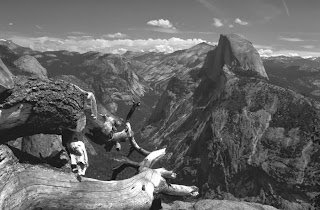
This is one of my most preferred photos by Carelton Watkins that was taken using his 'Mammoth Camera'. I appreciate the many aspects of nature this photo presents, which has influenced me to carefully select the locations I do my photo shoots in, due to the fact that the more subject matter there is, the more meaning there is to the photo. I think that Carelton Watkins took this photo at this angle (extreme wide shot) simply to allow us to appreciate the view Yosemite Valley provides, as an influence towards the United States Congress to establish it as the National Park. Although he was not able to change the composition of the features of this photo, he has carefully taken the photo at an angle where the photo is complete, leaving the top and bottom sections slightly clear. I think that Watkins' intention was to create a 'wide' focus, to again, allow us to appreciate the scenery. Depth is clearly shown within this photo, which is one of the main reasons as to why I am able to recognise the beauty of this scenery as the trees in front of the mountains are much bolder as the mountains fade away in the back as the pale tone contrasts with the sky. Again, the angle and composition is important in context with the trees as Watkins was able to chose the angle and place he took the photo from, to portray a certain theme/idea; depth of beauty.

 
This is a theme that is presented within all of the photos that I have analysed by these three photographers. This highlights the use of camera angles when expressing the beauty of a landscape which was a successful technique used by all photographers. After noticing this, I plan to use this skill when photographing landscapes to then manipulate using the darkroom as well as Photoshop. I could change the gradient and add black and white tones on Photoshop to show a connection between my work and Ansel Adams/ and Bill Brandt, whereas in the darkroom I could dodge and burn the photos. This will allow me to choose which areas I appreciate to then enhance to express the beauty of the specific area of the landscape.

Thursday, 21 November 2013

Personal Study Initial Ideas


Themes for personal study:

  • Portraying meaning using photographic techniques
  •  Influential Landscape photographers
  • Evolution of Landscape photography 
  • History of Landscape photography
Chosen theme: 
Influential landscape photographers. For my personal study I will write about a variety of landscape photographers, particularly from the past that have influenced my decision on the theme. Three of the artists will be: Ansel Adams, Carelton Watkins and Bill Brandt.

Tuesday, 19 November 2013

Evaluation of Enhanced Image Project

Throughout this project I did a range of darkroom experiments and imitated the same techniques using photoshop i.e: dodging and burning & vignetting, as well as doing handmade experiments that were inspired by artists such as: Amy Friend, William Hatch Crosby, Leslie David and Stephen Shanabrook. The purpose of doing a range of experiments (including: double exposures, combination prints, solarisation and chemigrams) was to discover different ways to enhance my photos within the theme I chose; landscape photography. Originally I intended on creating a visual connection between people and nature (an idea inspired by Florian Imgrund) by printing double exposures of people and landscapes on real leaves. Unfortunately, I was unable to develop this outcome due to not having enough high contrasting photos. As a result of this I decided to create a different outcome, portraying the same idea/theme. My final outcome is of landscape vignettes using a portrait cut out to create the vignette. This relates to my theme of connecting people with nature as you can see the landscapes through the portrait cut outs of my mum. I think that this theme is clearly noticeable as there are only two main aspects to each print; the body shape and nature landscape. 

I simply created each print firstly by taking photos of my mum and enlarging them to an A4 size to then print. I then did prints of the landscapes I decided to use, to find the settings I needed to use for my outcome as I used A4 sized paper for my outcome rather than the small paper I did my initial experiments on (therefore I could not use the same settings as previously). Once I found the settings, I traced the outline of the portrait photos onto black paper and cut the shape out. Lastly, for each print; double exposure or single exposure I placed the black paper with a cut out onto the photo paper and exposed the photo/s through the cut out. This technique allows us to see the landscapes through the portrait shape. I believe that the most difficult part of this process was finding the settings for the prints as they varied from my initial experiments. However, my outcome was a success as the theme I wanted to convey is apparent and clear, as well as the actual landscape photos. 

If I had more time with this project I would take more photos, in a variety of places with interesting aspects of nature to allow my outcome to look more fascinating. This would also give my a wider range of photos to choose from with different contrast levels. This would allow me to experiment with printing photos onto leaves to potentially use the technique for my outcome, if it turned out to be successful. I would also gain more research into my chosen theme to help me think of a variety of outcome ideas. Throughout the project I was able to gain more photography based knowledge in terms of enhancing photos as I used a wide range of experiment al techniques. 

One skill that I particularly think I improved on was dodging and burning (with my first dodging and burning experiment in my sketchbook). This is due to the fact that I was able to use the technique with a purpose by making it clear on the photo where the light was coming though around the trees, I was also able to make it look like a path was created by the sun on the grass. Whereas when I first used this technique, I dodged and burned places on the photo with no intention of making it look a particular way. 

Friday, 20 September 2013

Florian Imgrund, Stephen J Shanabrook and Amy Friend


This photography was created by a German Photographer named Florian Imgrund, a man who developed his first film camera in 2010. In his photography he plays on human nature by creating double exposures.

The photo above shows a pair of hands in a 'gripping' position' against an image of the forest. You can see the composition has been well thought of and makes the photographs more effective. Florian Imgrund has said that the shot was an 'anologue double exposure'. This means that the effect was simply created with the camera, rather than editing it digitally using photoshop. The use of black and white images adds to the effectiveness of the image, making it look highly captivating due to the dramatic gripping position of the hands with the the tall long trees, creating the impression that every aspect in this is 'reaching out'. This theme creates a connection between the hands and trees which I believe is that the person that these hands belong to needs the trees to live, as the trees are what provide oxygen for us to breathe. The position the hands are in gives a clear meaning, portraying the fact that the person 'needs' the oxygen rather than 'wants' it. Therefore I believe that the photographer (Imgrund) has cleverly composed the hands with the photo of the trees creating a double exposure. Double exposure is a technique that uses a piece of film which is exposed twice to two different images. The result shows the second image placed on top of the other.

After observing this photo and understanding the technique used to create this photo, I have been inspired by Florian Imgrund to create my own double exposure. This is because I am following the pathway of 'landscape photography' for my A2 project. I will use this technique to try and combine two themes together to go beyond the landscape theme. An example of what I could do is photographing portraits of people to place ontop of a landscape photo to create the theme of 'making the world your own' or 'human nature'.


 This photo was taken by and 'edited' by an artist named Stephen J Shanabrook. He was born in Cleveland, USA. He is an American conceptual artist who lives and works in New York City as well as Moscow and Russia, and has graduated from a university in Usa called Syracuse University, The Skowhegan School of Art. 

In 1995, Stephen Shanabrook begun his career by making different kinds of chocolate pralinĂ©s after being inspired by his fathers career, as he (Stephen) had to work in the family buisness' chocolate factory as a child, in a town in Ohio. Using this influence, he begun making chocolate sculptures surrounding and combining the themes: pain, death and disaster. Using this technique, as well as with the photo above of the crushed up portrait (known as photo surgery), his experiments give objects/pictures a new meaning. 

The photo above is a part of the collection of photos from the project Stephen did with another artist named Veronika Georgiva; 'Photo Surgery Project', which was selected for a Comme des Garçons ad campaign. 

I think that Shanabrook particularly used a female model in this photo to emphasise the fact that we are able to change the appearance of our face, which is something people believe is a way of ruining your face. Shanabrook has conveyed this idea using a handmade technique. 


pin pricked landscape photo by Amy Friend

This photo was taken and edited by a photographer named Amy Friend. She grew up on the outskirts of Windsor, Ontario, Canada and has previously studied at the Ontario College of Art & Design, which was after she travelled around Europe, Morocco, Cuba and the USA. After she went travelling, Amy returned to her studies and gained a BFA Honours degree, as well as a BEd degree from a university in York. She also managed to achieve an MFA from the University of Windsor, and a Social Sciences & Humanities Grant. 


Amy has had her work featured in a range of publications such as: the Magenta Flash Forward Emerging Photography Competition, EnRoute Magazine, LENS Magazine in China, and lastly The Walrus Magazine. Amy Friend has also had her work exhibited nationally and internationally. 

In the photo above Amy Friend has almost made an image look 'magical' by adding her own perception of the view using a handmade experiment technique. This technique is to simply make holes in the photo with a pin, and then shine a light towards the back of the photo. The 'spots of light' almost look like fire flies which is another part of nature, and relates to the naturalistic landscape in the photo. This has inspired me to use this technique in my work this year as I am focusing on landscape photography. I also believe that because she has used such a simple technique to alter a photo, it allows everyone to have their own thoughts/perception of what she was trying to portray, rather than having such an obvious subject matter. 
I think that Amy Friend has carefully thought about composition within this photo. This is because she has created the main focus of the landscape (using a particular camera angle which is 'portrait'), the boat with the two people in it. I think that the use of this was to focus our attention on this aspect to give the impression of movement and motion. She has cleverly highlighted this idea by adding light spots around the picture in particular areas such as the boat and the sea. The use of light it conveys a calm mood, which connects to the theme of the picture that I have identified; the movement of the rippling sea, allowing us to possibly feel the emotion that Amy Friend was feeling at the time this picture was taken. This creates a link/connection between the viewers and the artist herself.