Wednesday, 21 November 2012

David Bailey In-depth Analysis; Portrait Photography

Context:
This picture was taken by David Bailey. He's a British contemporary artist who was born on 2nd January 1938, in Leytonstone. The theme of this picture is glamour, using a model named Jean Shrimpton.

Meaning:
This photo doesn't seem to have an actual meaning. It looks as if David Bailey just took the picture for a photoshoot. I realised this simply by analysing the use of make-up, hairstyling, lighting and the simplisity of the picture (no background or other objects included). 

Aesthetic:
This photo is a close up view of Jean Shrimpton, focusing on the face/head mainly. David has clearly placed the lights above her head on either side, this creates a dark shadow underneath her chin as her chin blocks the light. Also, the same effect is created as her hair blocks some of the light on her shoulders, and above her eyes. 

The strong tones of white, black and grey have a massive effect on the picture as they strongly blend together with the use of the black and white camera, and the lights used above her head. Particularly on her hair where the highlighted sections look white as the light shines on it. 

Other images, by different (unknown) artists that I found with strong light effects:
http://crit365.com/crit104-studioportrait-lighting-with-just-one-light/
http://cadence-adayinthelife.blogspot.co.uk/2010_10_01_archive.html

Sunday, 18 November 2012

Andre Kurtesz In-depth Analysis; Still Life


   Context:
This picture was done by an artist named Andre Kertesz, a Hungarian photographer who was born in 1894, July and died in 1985. He named this art piece The Fork, also known as La Fourchette which was taken in 1928 and is his most famous pieces of Still Life Photography. I decided to analyse this picture because the shadows from the light create a very interesting effect. 

Meaning:
Another website that I looked at to understand Andre as an artist is Wikipedia: http://en.wikipedia.org/wiki/Andr%C3%A9_Kert%C3%A9sz. The genre that I would associate this image with is Still Life photography. I would also associate this picture with the two themes:'everyday' and 'household objects' because he has used everyday objects; a fork and a bowl which are household objects. I think that the simple title; The Fork states the obvious, informing us on what the picture is. 

Aesthetic:
To take this picture he has used a black and white SLR camera using film. He has clearly used a particular angle to take the picture to show the shadows created from the objects blocking the light. This created a strong contrast between the different tones of the objects and shadow. In multiple pictures he has used light and shadow.


Personal Response:
I really like the way that Andre has taken the picture from a particular angle to show the shadows created from the objects blocking the light. Also, he has inspired me to create pictures focusing on light and shadow, using shiny objects.


These two images were both created by Andre Kertesz as he uses light and shadow:
Smoke in Toronto
Lion and Shadow

I have selected this picture because I think it's interesting how Andre has photographed an image of a person's shadow, but we can't actually see the person.


Technical Studies Brief; Light Project


For this project there are many things that I'd like to accomplish. One thing that I'd like to do is research a variety of artists that focus on light with their photography. After researching them I would like to make my own pictures after being inspired by them. Artsist that I am keen on researching are: Pablo Picasso, Edgar Martins, Andre Kurtesz and David Bailey. When making pictures I would like to use a wide range of light techniques, such as: using light pens, using the moon/sun to reflect on large and small objects to create an effect, using an ordinary light. I would also like to use an SLR camera and a digital camera to take the same picture (more than once) to see the different effects of using each camera, as one will make the picture black and white, and the other will allow us to see it in colour. It will be interesting to compare the black, white and grey tones on a picture using an SLR, to the normal colours after taking a picture with a digital camera.

Saturday, 17 November 2012

Evaluation


  • Are you pleased with your final prints?
 I am pleased with my final prints as they all developed as I wanted them to eventually
  • How easy / difficult did you find making them? 
I found it quite easy to make the prints as I already knew what settings to use because I did photogram experiments before hand so I was aware of what settings I should and shouldn't use. 
  • Did you enjoy experimenting with the different techniques learnt throughout the project? 
I did enjoy experimenting with the different techniques, particularly the photogram technique which is what I decided to do as my final project. This is because it is a technique that allows you to alter the way people view objects.
  • How do your final prints link to the theme of 'Everyday'? What were your intentions / ideas?
My final prints link to the theme of 'Everyday' because I have used everyday objects to create each photogram. The objects that I used were: a perfume bottle, a pair of scissors, bracelets, rings and an earing. With these objects I used different techniques to make them look abstract. One technique that I used which I think had the best effect was the Chemigram technique. I did this by placing scissors onto a pice of photopaper and moving the pair a number of times whilst exposing to light. I then splashed developer onto the paper and rubbed some parts in with a paint brush rather than placing it into a tray of developer like I usually would.
  • Would you do anything differently if you could go back? i.e. shoot different images on your film or explore a different idea. 
If I could go back I wouldn't change any of the pictures that I created because all of them turned out as I wanted them to.
  • Which photographers did you look at for this project and which inspired you the most? Why? 
When I decided to create photograms, it was after I researched Man Ray and the photograms he made. 

  • Overall how did you find the project?
At the beginning of the project, I felt that it was quite difficult and tricky as the photo's that I took using an SLR camera were too dark, so I had to change my whole idea/theme. However, when I changed my idea to photograms and begun making the photograms I started to enjoy the project more and found it much easier.  

Targets: 
1. Include academic & technical language when analysing.
2. Focus on experimentation; complete each experiment. 
3. Compare and evaluate my work to others.

Man Ray In-depth Analysis

 Man Ray was a modernist artist who was originally from America but worked mainly in Paris. He was a part of the Dada and Surrealist movements which is very significant as he was one of the most popular artists within these movements. He did a wide range of media work but considered himself to be a paiter (mainly). In the art world he is noticed for his 'rayographs' which is a type of technique for producing photos, formally known as: Photograms. 

Context:
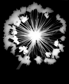
This piece of work (photogram) was done by Man Ray. I believe that this picture was just done as an experiment. I have chosen to analyse this piece because it looks like he tried to create an abstract image just like I will be doing. It seems abstract because at first I thought it was a pattern that he made, then I realised he placed a flower onto the photo paper. The fact  that it was difficult to realise what object he had used made it seem very interesting. For this photogram I think he would have used F.8 and 8 seconds to expose this image as those settings allow the object to show up clearly and sharp as well as the different tones. 

Meaning:
A quote once said by Man Ray: 'of course, there will always be those who look only at technique, who ask 'how', while others of a more curious nature will ask 'why'. Personally, I have always preffered inspiration to information'. This was not necessarily said about the picture that I am analysing but I believe that it can apply to all of the photograms that he created. This is because there is always a reason as to why he laid the objects out on the paper in teh way he chose to. If there was any theme for this photogram, I would say it could be 'nature' or 'abstraction'. Nature, because he has used a flower; abstraction because he has made the object look like something it's not.

Aesthetic:
The material used is a flower, and the technique used is named; Photogram. It has been done by placing a flower on top of a piece of photopaper and exposing it to light for approximately 8 seconds using f.8. The amount of seconds used and the F stop used for the picture has a big effect on the outcome; it allows all lines to look as sharp as possible. I think this aspect is important because the round pattern that the petal stalks create, make the image look abstract.

Personal Response:
I have chosen to look at Man Ray and his photogram as he inspired me to use this technique for my project. I selected this picture in particular because I didn't know what it was to begin with as it seemed very abstract, and this is the effect I want my photograms to create. For example: placing a perfume bottle upside down on the photopaper. I like the way that the flower fills up the majority of the paper, which adds effect to the mystery of what it is.