Monday, 16 September 2013
Free Range Exhibition
This picture was taken by photography student named Pavla Ondrova who has achieved a BA in photography. She quoted: 'Decommissioned is a body of work, which explores the relationship between humans and their natural environment and it emphasises the fragility and transience of the landscape. It is a visual exploration of Burkean notion of the sublime combined with contemporary understanding of the concept'.
This is my favourite piece of photography from the Free Range photography exhibition. This is because I like the way the photographer has taken the picture at a specific angle to almost allow us to appreciate the patter the grass creates that fades off into the distance. The angle the photographer has taken this in has made the ground look like a landscape photo, and has inspired me to use this technique for my landscape photography project. The different colours and tones of the grass (bright colours to dull from left to right) also create a pattern which makes the photo look more effective.
Wednesday, 26 June 2013
Norm Magnusson Inspired Experiments
My Norm Magnusson Experiments:
For these experiments I was inspired by Norm Magnussons art work on the right hand side of the page. In these photographs, Norm Magnusson has decorated nature in his own way by adding coloured paint and patterns and placed it back in nature to then photograph. He uses this technique to creatively to add a personal connection to nature. This is done as most nature is green, so he has painted various colours to the leaves, which I believe in a way brings it to life as it stands out from the other vegetation it is surrounded by.
During the process of doing my experimentation, I selected some leaves and painted patterns on them. For my first experiment, I used three colours: red, orange and yellow. I specifically chose those colours as they are the well known colours of fire, which I chose as a kind of theme for that leaf because of the shape of the leaves, where it has different sections that can be viewed as the same type of shape a flame creates. I therefore used the same colour order; red at the top, orange in the middle and yellow at the bottom, with these colour paints I created a pattern per section.
For these experiments I was inspired by Norm Magnussons art work on the right hand side of the page. In these photographs, Norm Magnusson has decorated nature in his own way by adding coloured paint and patterns and placed it back in nature to then photograph. He uses this technique to creatively to add a personal connection to nature. This is done as most nature is green, so he has painted various colours to the leaves, which I believe in a way brings it to life as it stands out from the other vegetation it is surrounded by.
During the process of doing my experimentation, I selected some leaves and painted patterns on them. For my first experiment, I used three colours: red, orange and yellow. I specifically chose those colours as they are the well known colours of fire, which I chose as a kind of theme for that leaf because of the shape of the leaves, where it has different sections that can be viewed as the same type of shape a flame creates. I therefore used the same colour order; red at the top, orange in the middle and yellow at the bottom, with these colour paints I created a pattern per section.
Whereas for my second experiment I used three leaves that were connected and used a paint colour per leave and did a different pattern on each leaf. I did this because I wanted to do a different type of experiment compared to the first one, where I used one large leaf where there was more space to decorate and make patterns, whereas for my second experiment I had much more confined spaces to paint on.
Tuesday, 25 June 2013
Coulsdon College Visual Arts Exhibition Review
These three pictures that I have presented are my favourite pieces from the Year 13's Photography Exhibition in my college. The theme of their project was called 'Inside Outside and Between' where they had to take pictures/ a picture of things in their chosen pathway for example: landscape, and present it creatively.
I thought that the show was very intersting as the photography students presented a variety of concepts and clearly thought aesthetics of every photograph they used as well as extra material. Particularly the photo at the top which is my favourite. This is due to the fact she/he has created an image surrounding other images; this student has cut out a shape of a building and placed black and white photos of the building within a border of another photo he/she had taken of that building. I think this idea is very creative as she has obscured a building with itself.
I will take the idea of using material to connect each picture (in the bottom photo) to my future projects because it will increase the creativity of my work by adding to the aesthetics.
Wednesday, 19 June 2013
Julie Cockburn Digital Work
![]() | |||||
| This is my first experiment that I made using Adobe Photoshop. These are the instructions that I followed: |
Create a new layer: Layer - New
Choose the selection tool in the tool box and make a circle shape TIP: Hold down alt and shift when making the shape to ensure a perfectly proportioned circle drawn from the middle
Fill the circle selection with colour of your choice using the paint bucket
Set the Layer Blending mode to 'multiply': find this in the drop down menu at the top of the Layers Pallet
Repeat this process to add a different colour circle!
For this experiment I purposely selected two primary colours; red and blue to place circles on the face. I placed the two circles over the main features of the face on top of each other so that another colour is created; purple. The Layer Blending mode that I used, named 'Multiply' adds a subtle colourful tone to the picture as the face and hair is still clearly visible, which makes the circles seem transparent.
![]() |
![]() |
I created the last three Julie Cockburn experiments using the tutorial on this video.
I think that altering the face in this way is very interesting. This is due to the fact that I have selected the main aspects of the face; eyes, nose and mouth to place around the face, in a chosen shape. I particularly like the picture in the middle because the technique that I used (making certain aspects of her face into shapes) makes it seem as if I removed the woman's original face and placed parts of it around her head, this highlights the fact that the eyes, nose and mouth are the most important, noticeable features of the face, which is what I wanted to portray.
For both experiments I have used a technique that highlights the main features of the face using Adobe Photoshop.
Tuesday, 18 June 2013
Handmade Experiments - inspired by Geraldine Georges and Julie Cockburn
Julie Cockburn experiments:
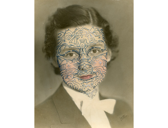
For the two pictures above I was inspired by Julie Cockburn as I embellished an old vintage photo of a woman and made it my own in the style of Julie Cockburn. I was inspired by this picture:
On the first picture I used a black fine liner pen to draw symbols and patterns like in the picture by Julie Cockburn. I then photocopied it and added some coloured tints to the face; cheeks, lips and eyes. I did this because I wanted to create the same type of effect Julie Cockburn did where there is colour on the face of the portrait.
Geraldine Georges In-depth Analysis
Geraldine Georges is a Belgian illustrator and graphic designer who has graduated from the Academy of Fine Arts in Brussels. She has worked for a number of advertising agencies but is now a freelance illustrator who blends photography and illustration in her work, creating a mix of mediums; photography and graphics. She does this using female portraits to make into abstract images, by expanding on the persons face/body with patterns (also sticking to the theme of fashion). I like the way that Geraldine Georges combines the two mediums as it is a very unique technique that I have not seen done before by another artist, it also does not take away too much attention from the original photo as only one colour has been used; black. This does not overpower the portrait because of the way that she has drawn 'calm swirls' around and within the portrait. She cuts up a portrait of a female, usually getting rid of some aspects of their body, for example in this picture she has gotten rid of of the model's left arm and the section between the arm and chest. This art piece is very effective because Geraldine has clearly extended the portrait using lines from the top of her head, above the arm, and around the chest area. She has also extended the hand by making drip shapes which is my favourite part as it seems as if something is actually dripping from the hand (this pattern has more of a meaning). I believe that she has focused on trying to create a mood within this piece due to the ways she has drawn swirls around the photo using the outlines that are already there. I also like the extension of the hair because she has created layers as if she has drawn a replacement of the hair that she could have cut out.
Saturday, 8 June 2013
Documentary Photography: Lin Osborn analysis
![]() |
| Rainbow by Lin Osborn |
This art piece was made by a photographer named Lin Osborn. She previously received a scholarship to Harrow School of Art and then studied at Surrey Institute of Art and Design where she graduated with a BA Hons in Fine Art in 2001. Lin then went on to study at Winchester School of Art where her interest for photography became apparent to her and increased.
Whilst creating this image named 'Rainbow', Lin Osborn has focused on 'creating single colour formations' to make an image of many different household objects placed next to each other.
She uses the tile technique for all of her photos but uses different ideas; in some photos she focuses on colours, and in others she focuses on a particular theme or object. I like the tile composition that she uses because it allows us to appreciate the detail of the image presented as she usually photographs an object/person close up for each tile. I think that the reason for Lin taking pictures of sections of an object/person, close up is because she intends on allowing the public to see and notice every aspect of what she has used in the picture. Whereas if she was to take pictures of the whole object/person we would be able to notice the detail of what it is. This links to the tile technique she uses; the purpose of creating tiles could be to show the different aspects of one thing, in a lot of detail.
My Lin Osborn inspired experiments:
![]() |
| Original photo of my college, that I took before the transformation. |
| Original photo (that I created using christmas ball ball's) that I used for my second experiment. |
My two experiments:
![]() |
I completed the two experiments using Adobe Photoshop. I selected the squares/tiles using the Rectangular Marquee Tool, I then dragged the selected square to another page on Adobe Photoshop which had a grid on it to guide me as to where I'd place each section.
Subscribe to:
Posts (Atom)


+copy.jpg)