These are some of the pictures that my group and I took using an SLR camera and a LED pen. As shown, we have used the light pen in a variety of ways to create different effects. For the picture at the top, one of us simply drew 'swiggly' lines around the object (a person). The second picture is my favourite out of this collection. This is because the accuracy of the image around the models head is perfect; we are able to see what the image created using the light pen is, and it's as if it fits on her head well. I also like the third image it is clear as to what has been drawn with the pen (a halo), which is effective as it visualy relates to the calm expression of the models face. The fourth picture was more of a random experiment, as all we did was swirl the pen around, creating this pattern.
I did this light painting experiment using Adobe Photoshop.
Steps to creating a light painting in Photoshop:
1. Create a new document and open up a new picture in Adobe Photoshop. 2. Create a new layer and select the free form pen tool to draw on the picture. 3. Select the brush tool, white colour, change the pressure to pen pressure using the brush pre-set menu. 4. Go to the path pallet, select stroke path and choose your brush tool. 5. Select the blending mode and alter the inner and outer lines by changing the colour, noise and size of each. 6. Create a new layer and using the free form pen, create more lines over the ones already there. 7. Select the path palet, and click on the same brush tool previously used. 8. Add the gaussian blur effect and lower the opacity of the line. 9. Create another new layer, and change the brush pre-sets in the brush tool option. 10. Change the spacing of the brush tool to then use to add 'sparkles' to the picture.
I undertook this experimentation to add to the range of ideas I could present for my final project, it has also allowed me to gain more knowledge on the use of photoshop and what effects I can create using the software.
These are my best portrait and still life prints that I originally took using a DSLR. My favourite picture out of these would be the one at the top. This is because I creatively experimented using the developer and a paint brush; after exposing the paper to the light on the enlarger, I placed a paint brush in the developer and dabbed it in various places on the image.
These are the photos that I took using a DSLR camera, F.8 in a dark room using a lamp to light up particular areas to create shadows that I wanted. If chosen these four photos because they are my best ones, as the other ones could look better, if they were more in focus.
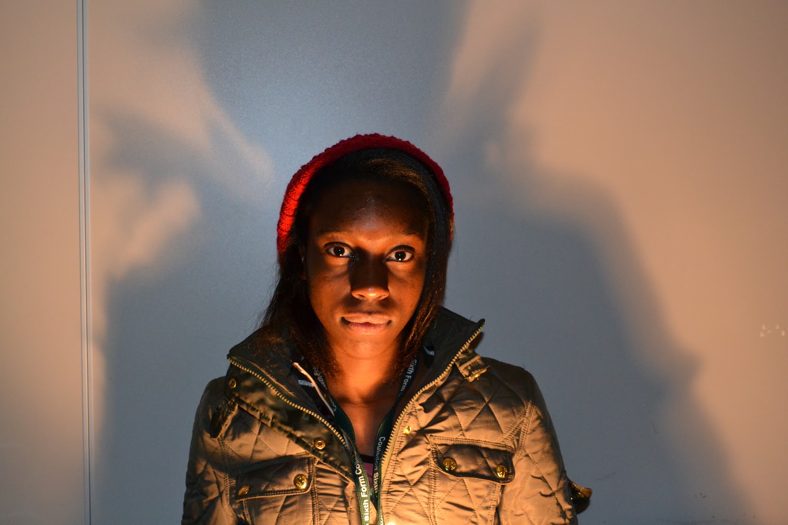
http://lightpaintingphotography.com/light-painting-artist/featured-artist-2/patrick-rochon/ Context: This light painting picture was made by Patrick Rochon who has been a solo light painter since 1992, but has done collaborations. He has been a part of groups for live performances where he and other friends created 'Light Warriors Tokyo', 'Boa' and 'Liquid Vision'. I think that this photo relates to the theme of portraiture photography. This is because the main focus of the picture is the woman's face, as it is a headshot photo. Meaning: To further my understanding of what genre of art has been used, I looked on this website, which tells me that it is a portrait picture: http://www.patrickrochon.com/archives/category/portrait. I don't think that this photo has a particular subject as the position of the woman and the use of colours and light painting doesn't symbolise anything. However the use of the direction of the lines of light allow the picture to look serious as it follows the direction she is looking in. Aesthetics: This photo was made clearly by using a digital camera, with no flash as that would prevent the bright colours from showing on the photo. I believe that 8 seconds was used to take the picture, where the woman was exposed for 4 seconds to begin with, and for an additional 4 seconds Patrick drew lines in the air using different coloured light pens, in front and behind the woman's face. The reason why I think that the woman's face was exposed for a longer amount of time compared to the light pens is because her face is clear and 'bright' whereas the colours from the light pens are quite faint. The use of a range of exposure times creates a good effect as it shows what the main focus of the photo is; the face. Personal Response: I like the way that the wavy lines allow us to 'relate' to the woman in a way; it evokes a serious emotion because of the way that the direction of lines links to the direction she is looking in. MyPatrickRochoninspiredwork: In this lesson we experimented with another form of light, using pictures on IPADs. We each took a picture of ourselves using an IPAD and a particular effect using the colours; blue, red, yellow, green and orange. We used this effect in particular to give a wide range of colours in our pictures, which allow it to look more interesting. For each picture we used 8 seconds and and aperture F5.8 on a digital SLR, and moved the IPAD in different directions around the person modelling. We did this (in groups) to add to our experimentation so we can pick a type of light photography to present in our final project.
Painting behind the object, using a range of speed to move the IPAD around
Random painting, keeping the IPAD still 4 times for 0.5 seconds each
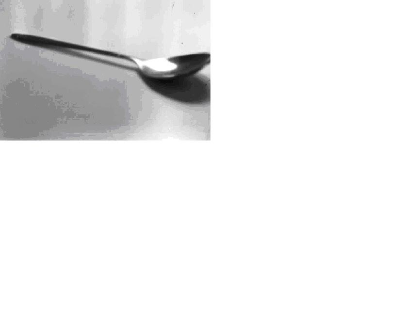
For this picture I used the settingsF.4, the filter, and one second exposure time. I used the filter to create a contrast between the different tones in the picture on the actual spoon, the shadow and surface the spoon was placed on. I think this was successful, however if I played around with the contrast more, and experimented with higher/lower contrasts I would be able to make improvements to the pictures. I decided to take a picture of this picture in particular as I wanted to have the ability to compare one of my still life photo's to one of Andre Kertesz's. Due to the positioning of my object and Andres objects, the shadows created are different. The shadow on my photo seems to be more stretched out whereas the shadow on the fork picture is more 'exact'. This is because I placed the spoon the right way up with the light coming in from the left at the back, allowing the bowl of the spoon to block the light. However, Andre Kertesz placed the light above the objects, which is why the shadows don't seem distorted compared to the shape of the objects, which is what would have happened if he placed the light in the same way as I did.


