Wednesday 26 June 2013

Norm Magnusson Inspired Experiments

My Norm Magnusson Experiments:


For these experiments I was inspired by Norm Magnussons art work on the right hand side of the page. In these photographs, Norm Magnusson has decorated nature in his own way by adding coloured paint and patterns and placed it back in nature to then photograph. He uses this technique to creatively to add a personal connection to nature. This is done as most nature is green, so he has painted various colours to the leaves, which I believe in a way brings it to life as it stands out from the other vegetation it is surrounded by. 
During the process of doing my experimentation, I selected some leaves and painted patterns on them. For my first experiment, I used three colours: red, orange and yellow. I specifically chose those colours as they are the well known colours of fire, which I chose as a kind of theme for that leaf because of the shape of the leaves, where it has different sections that can be viewed as the same type of shape a flame creates. I therefore used the same colour order; red at the top, orange in the middle and yellow at the bottom, with these colour paints I created a pattern per section. 

Whereas for my second experiment I used three leaves that were connected and used a paint colour per leave and did a different pattern on each leaf. I did this because I wanted to do a different type of experiment compared to the first one, where I used one large leaf where there was more space to decorate and make patterns, whereas for my second experiment I had much more confined spaces to paint on.

Tuesday 25 June 2013

Coulsdon College Visual Arts Exhibition Review


These three pictures that I have presented are my favourite pieces from the Year 13's Photography Exhibition in my college. The theme of their project was called 'Inside Outside and Between' where they had to take pictures/ a picture of things in their chosen pathway for example: landscape, and present it creatively.

I thought that the show was very intersting as the photography students presented a variety of concepts and clearly thought aesthetics of every photograph they used as well as extra material. Particularly the photo at the top which is my favourite. This is due to the fact she/he has created an image surrounding other images; this student has cut out a shape of a building and placed black and white photos of the building within a border of another photo he/she had taken of that building. I think this idea is very creative as she has obscured a building with itself.

I will take the idea of using material to connect each picture (in the bottom photo) to my future projects because it will increase the creativity of my work by adding to the aesthetics.

Wednesday 19 June 2013

Julie Cockburn Digital Work

This is my first experiment that I made using Adobe Photoshop. These are the instructions that I followed:
Open up your chosen image in Photoshop
Create a new layer: Layer - New
Choose the selection tool in the tool box and make a circle shape TIP: Hold down alt and shift when making the shape to ensure a perfectly proportioned circle drawn from the middle
Fill the circle selection with colour of your choice using the paint bucket
Set the Layer Blending mode to 'multiply': find this in the drop down menu at the top of the Layers Pallet
Repeat this process to add a different colour circle!


For this experiment I purposely selected two primary colours; red and blue to place circles on the face. I placed the two circles over the main features of the face on top of each other so that another colour is created; purple. The Layer Blending mode that I used, named 'Multiply' adds a subtle colourful tone to the picture as the face and hair is still clearly visible, which makes the circles seem transparent. 


I created the last three Julie Cockburn experiments using the tutorial on this video.

I think that altering the face in this way is very interesting. This is due to the fact that I have selected the main aspects of the face; eyes, nose and mouth to place around the face, in a chosen shape. I particularly like the picture in the middle because the technique that I used (making certain aspects of her face into shapes) makes it seem as if I removed the woman's original face and placed parts of it around her head, this highlights the fact that the eyes, nose and mouth are the most important, noticeable features of the face, which is what I wanted to portray. 

For both experiments I have used a technique that highlights the main features of the face using Adobe Photoshop. 

Tuesday 18 June 2013

Handmade Experiments - inspired by Geraldine Georges and Julie Cockburn

Geraldine Georges experiments:


The two images above are my experiments that I made after being inspired by Geraldine's art work where she combines the two mediums; graphics and photography. The first picture is my original experiment where I cut up a picture that I had previously taken of someone in my class, and edited on Adobe photoshop so that it was black and white like some of the pictures Geraldine Georges uses. I simply used a black fine liner pen to lines of different lengths and patterns to add an extention to the photo. I photocopied my first experiment and added another pattern to it (the second picture) which was drip marks as I noticed that Geraldine draws that on her art work. I like the way I have used a colour theme; black and white as adds a simple aspect to the work in comparison to the actual variety of patterns. 

Julie Cockburn experiments:


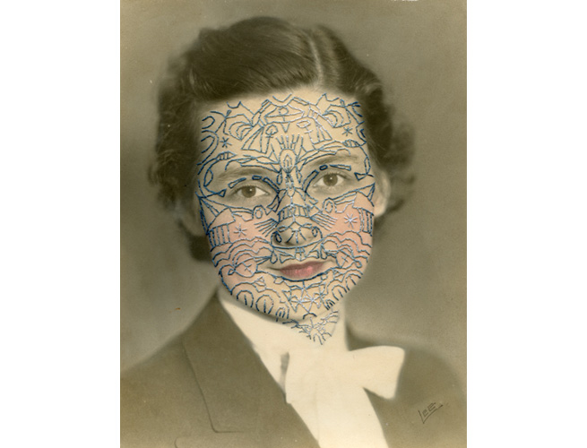
For the two pictures above I was inspired by Julie Cockburn as I embellished an old vintage photo of a woman and made it my own in the style of Julie Cockburn. I was inspired by this picture: 


On the first picture I used a black fine liner pen to draw symbols and patterns like in the picture by Julie Cockburn. I then photocopied it and added some coloured tints to the face; cheeks, lips and eyes. I did this because I wanted to create the same type of effect Julie Cockburn did where there is colour on the face of the portrait.

Geraldine Georges In-depth Analysis


Geraldine Georges is a Belgian illustrator and graphic designer who has graduated from the Academy of Fine Arts in Brussels. She has worked for a number of advertising agencies but is now a freelance illustrator who blends photography and illustration in her work, creating a mix of mediums; photography and graphics. She does this using female portraits to make into abstract images, by expanding on the persons face/body with patterns (also sticking to the theme of fashion). I like the way that Geraldine Georges combines the two mediums as it is a very unique technique that I have not seen done before by another artist, it also does not take away too much attention from the original photo as only one colour has been used; black. This does not overpower the portrait because of the way that she has drawn 'calm swirls' around and within the portrait. She cuts up a portrait of a female, usually getting rid of some aspects of their body, for example in this picture she has gotten rid of of the model's left arm and the section between the arm and chest. This art piece is very effective because Geraldine has clearly extended the portrait using lines from the top of her head, above the arm, and around the chest area. She has also extended the hand by making drip shapes which is my favourite part as it seems as if something is actually dripping from the hand (this pattern has more of a meaning). I believe that she has focused on trying to create a mood within this piece due to the ways she has drawn swirls around the photo using the outlines that are already there. I also like the extension of the hair because she has created layers as if she has drawn a replacement of the hair that she could have cut out. 

Saturday 8 June 2013

Documentary Photography: Lin Osborn analysis


Rainbow by Lin Osborn

This art piece was made by a photographer named Lin Osborn. She previously received a scholarship to Harrow School of Art and then studied at Surrey Institute of Art and Design where she graduated with a BA Hons in Fine Art in 2001. Lin then went on to study at Winchester School of Art where her interest for photography became apparent to her and increased.

Whilst creating this image named 'Rainbow', Lin Osborn has focused on 'creating single colour formations' to make an image of many different household objects placed next to each other.

She uses the tile technique for all of her photos but uses different ideas; in some photos she focuses on colours, and in others she focuses on a particular theme or object. I like the tile composition that she uses because it allows us to appreciate the detail of the image presented as she usually photographs an object/person close up for each tile. I think that the reason for Lin taking pictures of sections of an object/person, close up is because she intends on allowing the public to see and notice every aspect of what she has used in the picture. Whereas if she was to take pictures of the whole object/person we would be able to notice the detail of what it is. This links to the tile technique she uses; the purpose of creating tiles could be to show the different aspects of one thing, in a lot of detail. 

My Lin Osborn inspired experiments:


Original photo of my college, that I took before the transformation.
Original photo (that I created using christmas ball ball's) that I used for my second experiment. 

My two experiments:


I completed the two experiments using Adobe Photoshop. I selected the squares/tiles using the Rectangular Marquee Tool, I then dragged the selected square to another page on Adobe Photoshop which had a grid on it to guide me as to where I'd place each section. 

Julie Cockburn Portrait In-depth Analysis


This photo was created by Julie Cockburn, a modern artist who creates a link between the past and present with her photography. She does this by embroidering, cutting and collaging existing pictures and makes them her own. The pictures she uses range from Hollywood actors to American high school pictures that were taken in the 50s. As she was very obssessed with photo's from an early age she aimed to bring them back to life by altering them in her own way. When deciding a way to change the image she considers all aspects of the photo, such as: the photographer who chose the position, the models and the actual final printed image. 

Whilst living and working in London Julie studied at Chelsea College of Art and Central ST Martins College of Art and Design. Her work has been exhibited in a variety of places such as: the UK, United States and Europe.

She has simply brought this photo 'back to life' by adding colour to it. This image was originally a black and white photo of side view of a man and woman who appear to be a couple. Julie Cockburn has simply brought this photo 'back to life' by adding colour to it. I like the way she has created two circles using two specific colours; pink (a feminine colour) and blue (a masculine colour), and blended them inbetween the man and woman. The blend of colours is relly effective because it visually creates a link between the two models, possibly enthasising the fact that they're together, as a couple.

More work made by Julie Cockburn:


In the two portraits above, Julie Cockburn has altered old photos to make them look more modern. She has done this simply by changing this face using a repetitive pattern of a particular shape; in the first on she has used triangles whereas in the second photo she has used ovals. I like the way she has done this as she obscures their face hiding the models identity, but not all of it as the eyes and parts of the lips are still visible. 

Norm Magnusson Landscape In-Depth Analysis

This art piece was created by and photographed by a contempary New York based painter and sculpturer named Norm Magnusson. He is a New York based and political activist who was born on March 20th 1960. He is also the founder of the art movement 'funism' that begun in 1991. He started his career by making allegorical animal paintings including social commentaries, and realised his interest in political art in particular and how it could be used as persuasion.

This directed him into the public community where he made a variety of short videos, viral emails and roadside historical markers which led him to being on the U.S national television.

Through his work he tries to bring across messages to the public. For example: the signs presented at the top of this page which were a part of his project named '1-75'. This projectconsisted of of signs with a historical content written on them which he placed in 50 different placeson the Interstate 75 highway. he did this to inform the public about a specific person, and their beliefs who stood in the spot where the sign has been placed, as well as to inspire others along the route of which the markers were placed. I like the way that he has used two bright primary colours for the signs: yellow and blue which stand out. I think that the reason for his choice of colours is to catch the publics attention to understand the importance of the message.

After he did this project he created another one in 2009 which was called 'Decorating Nature'. Throughout this project he decorated 100 pieces of nature by using various colours of paint to add patterns on different types of vegetation/nature for example: leaves, rocks, trees, pine cones etc. Norm Magnusson said that this project is 'art that is aesthetically and intellectually accessible and deals with important themes'. The purpose of this second project was for Norm Magnusson to express the connection he believes he has with nature, by taking it out of nature to 'edit'/ alter it, and place it back in nature with his own 'touch' to it. 

I like the second picture where Norm Magnusson has painted circles onto a brown leaf because he has made it stand out from the rest of nature it is surrounded by. This is due to the fact that the leaf is brown as well as the nature around it, therefore blended in as a part of nature, but now that it has a colourful pattern on it (done by Norm Magnusson himself), that specific piece of nature visually shows a connection between Norm Magnusson and nature.

Henrik Bonnevier Still Life In-depth Analysis


This picture was done by a man named Henrik Bonnevier, born in 1972 who at first aspired to be a skiing photographer and is now a photographer that managed to create a CD cover, which he did not dream of doing. I believe that this picture is something you'd find in a magazine, for example: Vogue magazine. This is due to the fact that Henrik Bonnevier is clearly advertising one of the objects in the picture: Chanel perfume. The fact that he is advertising a perfume shows that the picture has a social context. 

I think that the theme of this picture is fashion and music. This is because he has used a variety of fashionable objects; a purse (which I think is the main focus); jewelery; and a shoe, as well as three pianos. The reason why I think that the main focus is the purse is because the Prada badge/logo is clearly shown, therefore that must be the brand Henrik is advertising. 
 
Henrik has used two very vibrant colours; red and blue which both stand out from each other. I think that this technique makes the image very eye catching. Henrik has created a surreal theme by playing with the size of the objects and making each object either smaller or bigger than the real life size version. He has done this with every object, except the purse that's being advertised. I think that he used a life size version of the purse because it's the main focus of the picture, therefore he allowed it to look large compared to some of the objects. 

I have also noticed that the compostition of the objects seems very random, that could have possibly been done on purpose which makes the image look very interesting. He has clearly thought about the colours he uses as they are both very bold and vibrant which creates a 'striking' effect.

I think that this picture is visually attractive due to the use of bright colour, random composition and glossy effect on the objects. I think that the colours used can allow the person looking at the picture to feel very energetic due to the fact that they are very bright/vibrant. When I first saw it, it reminded me of a surrealist picture that Rene Magritte made due to the different sizes of objects that were unrealistic.

The picture by Rene Magritte:


More work made by Henrik Bonnevier:

In the two photos Henrik Bonnevier has created the same type of composition; using objects that (could be someones belongings) are of a range of sizes placed around and on top of each other. I like the way that he always uses bold colours, and only two; on for some of the objects, and another for the background and other objects. I have noticed that he has used a background colour and then a shade of that colour for the furniture, this creates a 'base' for the photos. Whereas for the persons belongings, he has used another colour to make them stand out from the other colour used. I think this was his intentions as he wanted the objects (belongings) to be the main aspects of the art work.

Jan Von Holleben Inspired Photoshoot

 In today's lesson my class and I created our own Jan Von Holleben inspired experiments. We thought of some ideas to stick to theme of Jan Von Holleben's 'Dreams of Flying'. In the previous lesson we thought of basing our experimentation on one of our class members birthday (Shaniece). We all liked the idea of having a large cake as the main focus with all of us popping out of it, whilst Sheniece was floating above it holding birthday balloons. (The section with the balloons was inspired by the image below created by Jan Von Holleben).


Once we tried to think of materials to use to make the cake, we realised that it would be too difficult to make a cake out of materials, e.g:sugar paper, large enough to be visible when taking the picture from a birds eye view angle. We then decided to change the idea and have four different characters in one photo. The four characters we thought of were: one person with rocket shoes; another with angel wings; a third inside a balloon and the fourth person would be holding balloons. Throughout the proccess of creating these images we ensured that each person looked as if they were flying in the sky, so that it relates to the theme of: 'Dreams of Flying'.

These are images of some the students in our class preparing the props for the photoshoot:


The photo on the right shows Sheniece making the angel wings and me cutting out fire flames from card.


The photo on the left shows Dee-Kay tying balloons together.


Overall, the props that we used were:            - balloons
                                                                 - string to tie the balloons together
                                                                 - orange and yellow card for the fire
                                                                 - large sheets of clear plastic for the bubble
                                                                 - white card for the angel wings 
                                                                 - a large blue sheet for the sky
                                                                 - white cotton wool for the clouds 


To begin with, we spread the blue sheet out, as the sky.

We then placed the objects for the first photo onto the sheet in the composition we thought looked the best.

Three of us; Dee-Kay, Toni and I instructed our two models; Ben and Shaniece on where would like them to lie down and what positions they should be in. This picture was unsuccessfull because it is visually unclear that Ben, on the right is in a bubble, however the way that Shaniece is holding the bubble is obvious that she is supposedly flying in the sky with balloons. Another aspect to this picture that made it fail is the layout of the cotton wool; it doesn't look like clouds.

As a result of the unsuccessful image above, we decided to change the model inside the balloon to Dee-Kay as he would embrace the role more, we also changed the character that Shaniece was; instead of holding the balloons she was an angel. We decided that Shaniece should be an angel because we thought about the aesthetics of the picture; rather than using pink balloons we decided to create a colour theme using; blue, white and a semi-transparent piece of plastic. This theme creates a calm mood which ties in with the other theme involved; flying which is also 'calm'. 

This picture was created using guidance and instructions from Ben and Shaniece.

This picture is the development of the picture. In this photo we have three characters; a boy flying with rocket shoes (Dee-Kay), me as an angel flying with wings, and lastly, Toni flying with balloons. Also, in this picture Shaniece is fixing the props in a way she thought looked best.


This is the final photo of Dee-Kay, Toni and I, which I believe turned out to be very successful as our characters are visually clear & I think we actually look as if we are flying in the sky. The only negative side to  this photo is the layout of the clouds; as the balloons have been placed ontop of some of the clouds, it is hard to realise what the cotton wool is supposed to be.


Friday 7 June 2013

Jan Von Holleben In-depth Analysis


This image was created by Jan Von Holleben, a man who was born in 1997, Cologne and spent her childhood in the southern German countryside and is currently a cinematographer and child therapist. When he was 13 years old, he went in his father's career in photography and begun experimentation with 'magical tricks'. After teaching children with disabilities at a school in Freiburg, he moved to London and achieved a degree in the Theory and History of Photography at Surrey Institute of Art and Design and became well known in the photographic scene within London. Throughout his recognition in London, he worked as an art and photographic director as well as a picture editor.

In a previous interview Jan Von Holleben spoke about what he most likes about photography, and said that he likes the fact that he has 'total freedom to switch between vision and reality or to combine both to whatever levels'. He also mentioned that 'people are so dramatically receptive to photography' which links to the photo above of a boy laying on the floor holding balloons pretending to fly in the sky. I believe that the phrase and the photo relate because the model in the picture is clearly being 'receptive' to the idea presented by Jan; the way he is lying down is quite dramatic and makes it seem as if the balloons are pulling him across the sky (which is actually the floor) which is what I believe was Jan's intentions for the image.

I think that Jan Von Holleben has carefully thought about the aesthetics of the image as all of the colours blend together well; he has focused on using red/orange/brown/cream and yellow mostly. This is my favourite picture from his collection of 'Dreams of Flying' because the positioning of the model and the balloons makes it very effective.

Meaning:

In an interview Jan Von Holleben said: 

'One has to take into consideration that I am a critical child of my own generation.
I saw bits of the 80s, the 90s and the change of the century. Visual culture has done ANYTHING possible within those years. Everything has been retro-ed or emerged from its own potential. Digital photography got invented and created full democracy amongst the medium. For myself and my photography, I try not to fall into any styles or trendy features. I am a purist and probably rather a visual communicator or illustrator than a professional photographer in the common sense.
Most of the work I do is based on text or theory which I translate into images. I try to use a neutral and timeless style and my grammar is based on a fun and easy approach to the subject matter.

My procedure would be:
Fully understanding the subject matter (research), then walking with the idea for some days, starting with some sketches on paper (for myself as memory of ideas but also to explain my team and possible models how my idea works), starting production (which can be a 10 minute shoot in the studio or a two week project or split into various individual shoots depending on project) I am extremely pragmatic about my time and efforts. No fuzz and most of the times my team and I look like some funny immature photo-students when doing projects (which gives us usually access to all areas as I am hardly ever taken serious by outsiders)

Question: Hidden meanings? Are there any?
If at all: Life is factual very easy and photography is a piece of cake (if you take it serious)!
The best feedback I get from people on a regular basis is, that I make them very happy. Maybe that is a hidden meaning? Maybe that I truly enjoy what I do as a job and see no boundaries. Photography has not many boundaries.


I can work on a book with Steidl one day, can shoot advertising the next, work with various magazines and make a fine art exhibition at the same time. All in one week. Freedom.
I can switch between studio, outside location, business center and shopping mall or black and white, snap shot style or colourful pseudo lifestyle photography. More freedom.'